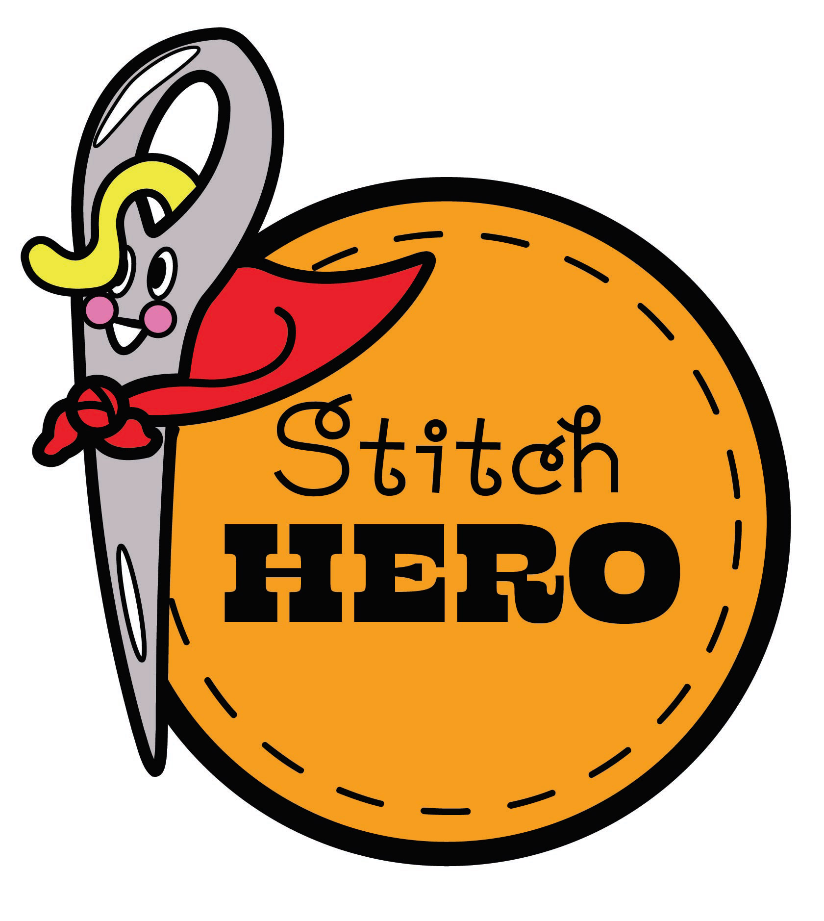
Behind the Design: Stitch Hero
Every brand starts with a story, and Stitch Hero was created with one simple idea in mind—what if repairing a stuffed animal felt like rescuing?
Stitch Hero is a playful, kid-friendly brand focused on “rescuing” damaged stuffed animals and bringing them back to life. Instead of presenting repairs as something boring or routine, the concept turns each fix into an adventure. Torn seams become “battle scars,” and every stitch is part of the recovery process. This storytelling approach helps create an emotional connection, especially for children who see their stuffed animals as more than just toys.
When designing the logo, I wanted it to feel friendly, safe, and imaginative. I explored soft shapes and rounded typography to make the brand approachable, while still hinting at the “hero” theme. The goal was to balance comfort with a sense of excitement—something that feels both caring and a little adventurous.
Color choices played a big role in this. I leaned toward bright, cheerful tones to keep the design fun and inviting, while avoiding anything too harsh or serious. This helps the brand feel welcoming to both kids and parents.
One of the biggest challenges was making sure the concept didn’t feel too complex. Since the audience is younger, the design needed to stay simple, clear, and easy to understand at a glance. Through feedback and revisions, I refined the logo to better communicate the idea while keeping its playful personality.
Stitch Hero reflects my approach as a designer—I enjoy creating brands that tell stories, spark imagination, and connect with people on an emotional level. For me, design isn’t just about how something looks, but how it makes someone feel.
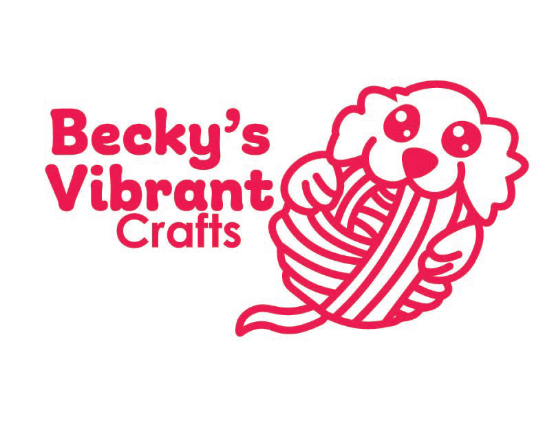
Behind the Brand: Becky’s Vibrant Crafts
Becky’s Vibrant Crafts is a colorful, creative space designed to inspire imagination through hands-on activities and playful design. The brand focuses on bringing together crafts and toys in a way that encourages children to explore, create, and express themselves freely.
When developing the concept, I wanted the brand to feel energetic, welcoming, and full of personality. The goal was to create a space where creativity feels accessible—something that doesn’t feel intimidating or overly structured, but instead fun and open-ended.
Visually, I leaned into bright colors and playful layouts to reflect the excitement of making things by hand. The use of bold, cheerful tones helps communicate joy and curiosity, while softer shapes and friendly typography keep the brand approachable for a younger audience.
One of the key ideas behind this brand is the connection between play and learning. Crafting isn’t just an activity—it’s a way for kids to build confidence, problem-solve, and express their ideas. Because of that, the design needed to feel both fun and purposeful at the same time.
Throughout the design process, I focused on making sure the brand felt consistent and engaging across different touchpoints, whether it’s packaging, signage, or promotional materials. Each element is meant to feel like part of the same creative world.
Becky’s Vibrant Crafts reflects my passion for designing brands that are not only visually appealing, but also meaningful and experience-driven. I enjoy building concepts that encourage interaction and creativity, especially for younger audiences who thrive in imaginative environments.
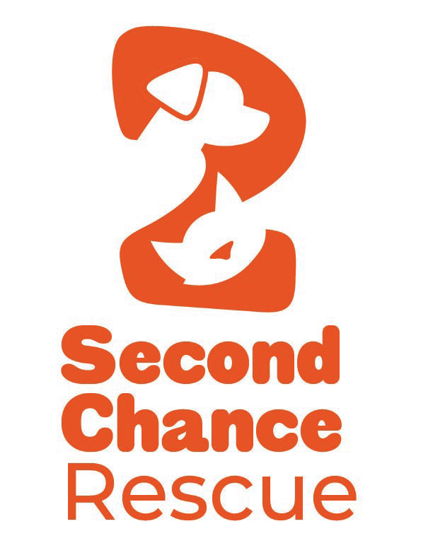
Behind the Design: Second Chance Rescue
Every design begins with a story, and Second Chance Rescue is rooted in one of care, renewal, and compassion. This project was created as a fictional company focused on adopting out cats and dogs, allowing me to explore branding for an animal rescue while emphasizing empathy and connection.
At the heart of the logo is the bold number “2,” symbolizing a second chance. Rather than leaving it as a simple numeral, it was transformed into a meaningful visual by incorporating the silhouettes of animals within its shape. These forms subtly represent rescued pets, reinforcing the mission without overwhelming the design. The integration of these shapes creates a balance between clarity and creativity, allowing the viewer to discover the meaning rather than having it explicitly spelled out.
The choice of color plays a major role in the emotional tone of the design. The vibrant orange evokes urgency, care, and passion — qualities strongly associated with rescue efforts. It immediately draws attention while also conveying warmth and compassion, which are essential to the brand’s identity.
Typography was chosen to complement the symbol. The bold, rounded lettering in “Second Chance” adds a sense of friendliness and approachability, while “Rescue” in a lighter weight creates contrast and hierarchy. This pairing ensures that the name is easy to read while still feeling welcoming and human-centered.
Overall, the design aims to be simple yet impactful. It avoids unnecessary complexity while still telling a story through shape, color, and form. The result is a logo that not only represents a rescue organization but also communicates hope — the idea that every animal deserves a second chance.